Thursday, 31 March 2022

VIRTUAL EXCURSION - SURFERS PARADISE

 UNIT THREE  

SEMESTER ONE 2022


VISUAL RESPONSE TO PLACE


TASK: 

To present, in visual form - one or more facets of life on the Gold Coast inspired by the excursion to Surfers Paradise. 

 Students were asked to consider the people, the place, the environment.

The result is an individualised, reflective response, with a depth of meaning, using the language of art.


MEDIA:

Select your media in response to the concept and your focus.

You negotiate the media - materials, techniques, technologies and processes that could include 2D media, mixed media, found media, 3D media, electronic, time based or new media.


Callum O’Connor 
A Surfers Paradise
2022
Copic markers on paper
42x29cm

Surfers Paradise, located in Gold Australia, is one of the most well-known suburbs due to the multiculturalism, the beach and the clubs. With surfing one the most popular sports/activities of Australia, I wanted to incorporate the symbol of ”Surfers Paradise” by creating a scene which seems too good to be true. 
Local surfers are constantly spending their time in the water and when it’s a good day to surf - that time out in the beach can really make their day. 
By using symbols and incorporating the famous activities of Surfers Paradise I created an artwork which symbolizes what “Surfers Paradise” really is. 
The beach is loved by the people of the Gold Coast and by using the beach to connect with the audience I was able to create my artwork “ A Surfers Paradise” 


Cooper O’Neill
Black and White
Coloured markers and paper
2022
42 x 29cm paper

The Gold Coast is known for its fun, sun, surf and sand. It is a beautiful place frequented by tourists and locals who come to enjoy the warm tropical weather, beaches and healthy lifestyle. However, there is often another side to 
this seemingly ‘perfect’ location… a darker side. 
Unfortunately, Cavill Avenue and Surfers Paradise can also be a dangerous
place, known for its nightlife, drugs, alcohol, criminal activity and violence. 
My artwork comprises of two large, wide eyes representing the different ways Surfers Paradise can be seen. Within this artwork I wanted to incorporate iconic imagery associated with Surfers Paradise and Cavill Avenue. 
This positive imagery includes the sun, swimwear, scooters, palm trees and the McDonalds ‘M’ golden arches found at the end of the mall. I have altered the ‘M’ golden arches shape in my artwork, in keeping with the style of my mentor artists.  
On the flip side, through the other eye, I have included some negative imagery including weapons, drugs and damaged property as some of the unfortunate aspects of this location. 


Hayden Keldie-Genner
Missing
2022
Photoshop
29.7cm x 42.0cm

Covid has a serious impact on not only Surfers Paradise, but also the Gold Coast. With the teenagers excited about finishing school, one way to really go out with a bang is to finish off with Schoolies. The cancelation of Schoolies left many teens disappointed. For this artwork, I wanted to include the famous Surfers Paradise sign, but with my spelling mistake I wrongly wrote Surface Paradise, but for a comedic effect I decided to keep it. The negative space people show that they are missing due to covid, and as you can see the covid-19 virus photo is on top of the Surfers Paradise sign, meaning that covid is overlooking Surfers waiting to pounce again.


LUCAS YANG
Cyber Surfers
2022
Procreate
3333px X 2086px

Surfers Paradise has introduced many more innovations through technology
development in the past years and Surfers Paradise never stops changing. As
a result, new features are adding to the culture of Surfers Paradise every year.
This speed of growth makes people want to think about what Surfers
Paradise would look like in the future, perhaps when humans have stepped
into the new age. I rebuilt Surfers Paradise to think of the ‘future’ in this
artwork, inspired by futuristic city designs and games. Although, using the
city itself, it is easy for me to add the icons and symbols. The bright
neons highlighted the icons and logos already existing in Surfers Paradise,
while the blurry background reflected the unpredictable future, and anything
could appear.


 Lyndon Carrigan
Bush to beach
2022
Coloured pencils on paper
29.7 x 42cm 

Bush to Beach, COVID, border closures, lockdowns took away the shine and beauty of our premier tourist destination, Surfers Paradise. The drought had stripped the heart and soul of the land. The country is my lifeblood. Now it's time to bring my rural family back to the beach. Country people long for beach holidays. With borders closures removed the country needs the ocean and the ocean needs the country tourist. 
My piece of art is to reflect my life in the country and the coast. Drawing attention to the shape of the iconic Surfers Paradise sign, uniting my family farm name. As the farmer reflects on his day, watching over his pride and joy, peace and silence can be appreciated country or coastal. The golden sands, water views symbolic of the sunshine state. The wide-open space, green no longer dust hazed skies. The defined line of green and sand no divide. The windmill spins fresh air of life and the breeze will be felt by all.


Nicholas Clayton
Cultural Difference
2022
Coloured Pencils on Paper
42 x 29cm

Surfers Paradise is the epicentre of Gold Coast’s cultural diversity, not only through different races, but also through cultures like surfing, life saving, groups of teen girls, and the culture of stores along Cavill Avenue. 
Within my work I aspire to create a piece that represents this multiculturalism through a singular figure. This will include 6 different symbols. 1st being a teen girl seen roaming Surfers, 2nd being a woman in a hijab, 3rd being an Aboriginal woman, 4th being a man surfing, 5th being the surf life saving culture,  and 6th being the shops and outlets scattered through Surfers Paradise. The face has been split into 4, to portray symbols that express each culture, the body portrays the surf life saving culture, and the background expresses different shops. The use of pencil was aimed to depict the fine details and shadows of each person, and in the reflection of the teen girl’s glasses shows the Surfers Paradise.


Cruz Ferris-Nathan
Graffiti
2022
Coloured Pencils on Paper
42 x 29cm

Crime, Drugs, Graffiti and Vandalism is a very huge thing in Surfers, especially at night time when things can get rough. 
All this interested me so I decided to do the drawing about the crime at Surfers


Lachie Mayne
Surfers Paradise
2022
Acrylic paint on canvas
36 x 26cm

Surfers Paradise is all about the city. Not much goes on with mother nature in Surfers Paradise. My painting shows all of the nature with the front of Surfers. My artwork shows all of the three components of earth, sea, and sky which I have expressed in the painting. 
I have tried to use the more natural colours in the artwork.


Luke Reinhold
In the eyes of a night-lifer
Digital (Photoshop)
2022
282 x 141cm

Nightlife in Surfers Paradise has become extreme over the years. From simple clubbing and alcohol to regular use of needles. It has left an impact on the city's reputation, as the after-effects of nightlife are revealed the next morning. Used needles and bottles are leftover from illegal acts such as drug use. 
Within this piece, I want to incorporate the view of a regular night-lifer, commonly known as a 'clubber.’ The majority of the piece involves the image of Surfers Paradise during the day. Whereas icons such as hanging underwear and leftover bottles reveal the acts that take place during the night. The male figure in the piece is the main focal point. The man’s view is locked not onto the ocean, but on the large packet of pills. His shadow has now become a silhouette of a needle, communicating the idea that he partakes in regular use. Other than the now corrupted sandcastle on the shore, there is no other figure to be seen. As the piece is to represent the view of an offender and clubber, the only figure being noticeable is another clubber.


Jack Primi
Surfers Paradise
2022
Photoshop
29.7cm x 42.0cm

My Artwork done on photoshop is evidence on what happens in Surfers at night when all the lunatics are out doing illegal stuff.


Jonathan Paterson
The Collapse of Surfers Paradise Commercialism - 6 frames
Chalk pastel on paper
2022
21x29.7cm

Eventually in millions of years, everything man-made including buildings will decay and all that will be left is nature in it’s most beautiful state. My work shows the Q1, one of the main attractions in the Gold Coast sinking into the water while on fire. This is to show the two elements: fire and water. The Q1 is usually a silver/grey-looking colour, but I made the Q1 more of a mossy green to show how it has aged throughout all of the years.


Stephen Eardley
Surfers is open for business again
Photoshop
2022
42 x 29cm

COVID has had a dramatic impact on the Gold Coast in the past two years.  As a premier tourist precinct within Australia the lack of customer has seen much change and an anticipation for the 
re-opening of boarders and flow of money back in to the region.
The infrastructure of Surfers Paradise remains, though largely empty or deserted. 
Within this work I wanted to incorporate the symbol of the light rail – the transport corridor along the Coast and utilise reflections to communicate a story. Incorporating iconic imagery and people locates the artwork within the tourist precinct and allows a vehicle to manipulate ideas. 
There are reflections on the tram that speak directly to the signage that has been across Australia about Covid and testing centers juxtaposed with reflections of the glory of past days and hope for days to come – such as a Meter Maid. I have manipulated the Surfers Paradise sign to read ‘Open for Business’ with Princess and a stereotypical surfer awaiting the arrival of an influx of tourists. I chose to stay with bright and hopeful colours because as the saying goes –
 ‘Beautiful one day, perfect the next’.


Friday, 18 February 2022

Saturday, 13 November 2021

2022 - SEMESTER ONE

 UNIT ONE

TASK

Using a conceptual approach, develop a self-portrait based on a three-dimensional form – 

a box which measures 12cm x 12cm x 12cm. 

You may explore the volume outside, or inside the box if it relates to your focus.


How you interpret, perceive or alter the form will be determined by the message you wish to convey about yourself through the work.


The work should be completed and presented so that it is seen as a record of your thoughts, beliefs, opinion and reactions – therefore personal in nature.


Lyndon Carrigan
My life inside a box
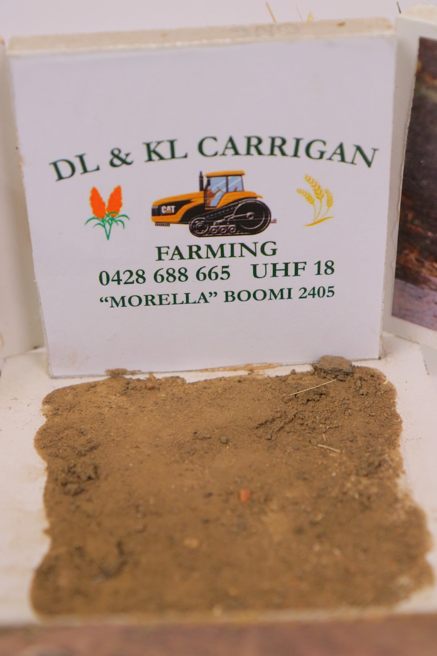
Mixed media –wooden structure, wood beads dowel, pva glue, spray paint, wood glue, wheat heads and seeds, Wool, paper, stubble, dirt and cattle tag.
12 x 12 x 12cm

I live and breathe agriculture. The AG industry can be a cruel environment at times, fires, floods, dead stock, naked barren ground, snakes and rip-roaring droughts. But it's the heart and soul of the earth. Our dirt's have blown by us in dust storms, they have grown our crops that feed us all. Through all the tough times the dirt still gives us peace.  We own that couple of inches of top soil and it makes me happy. The peace and growth that comes from the land is so rewarding, but there is blood, sweat and tears. The colours are neutrals, they can be flat golden and barren. The colour comes from the stock that are your family and pets. They have survived the drought with us, we hand feed them for survival, they are our friends, at times they challenge us, but what doesn't. We speak to our animals and they speak to us. They are the counsellor for mental health as they are challenged when we are. The peace I find living on the land a blessing. I am country, country is me. City life doesn't give you stars but my life does.


Nicholas Clayton
“Life In a Lantern”
Mixed media – wooden slabs, wooden pillars, gold-coloured screws and hinges, baking paper, nails, candle, graphite pencil, white paint, brown spray paint, main-beach sand.
12 x 12 x 12cm

The presented artwork delves into the aspects of my life, hence the choice of title: “My Life”. This is represented through drawings that portray the symbols of the main topics and lifestyles that I am heavily involved in and thoroughly enjoy.
A Wave = portraying my love of the beach, surf and the lifestyle that comes with it; Swimming Goggles = representing my passion for my commitment to the sport of swimming; and The Southport School emblem = interpreting my commitment to the culture and brotherhood of the Southport School. The color pallet of the box consists of white brown paint, which is used to portray the stereotypical ‘beachy’ style that the common beach-side house now has today, as well as also being contradicting colors to negate the blandness of just plain white. To coincide with this topic of aquatic-life, sand has been placed within the product from the local beach – main beach – to give a natural aspect to it. The door added is to be a physical metaphor, that when opened, it is as you are delving into my life. When the candle is lit and the surrounding area is in darkness, the picture on the outside are magnified and become transparent rather than translucent. The reasoning behind the name “Life in a Lantern” is due to my major aspects of my life are being portrayed in a design much like that of a lantern; with the fire inside creating and bringing to like representations of my life.


\

Cruz Ferris-Nathan
Untitled
Mixed media
12 x 12 x 12cm

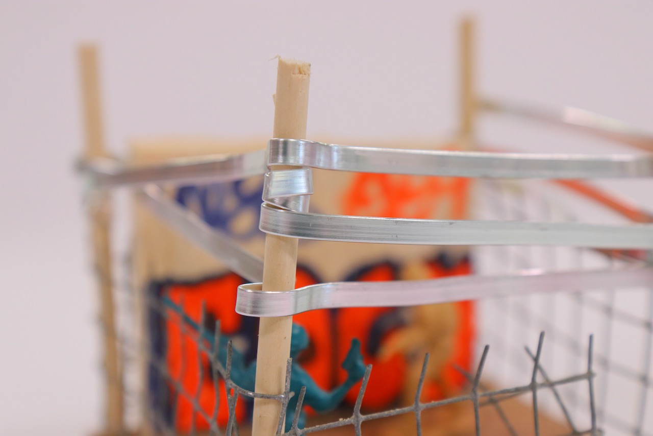
My artwork is about 2 guys breaking into a restricted area and doing graffiti on an abandoned wall. Expressing their art to themselves and for others to see, if anyone came across it.

Instead of using pieces of paper and markers, they decided to go with spray cans and a wall (train) to express their art and emotions on.


Michael Keet
Untitled
Mixed Media
12 x 12 x 12cm

In my artwork I have decided to showcase 3 main scenes in my artwork. The first side is a replica of a tennis court. Currently tennis is one of the most important things in my life and is something I work hard at to achieve my goals. The next side is a symbol of TSS which is another important thing in my life. I had used a mask within my artwork to show what is important to not only me but the school as well. Finally the third scene is the interior of a candle burning with a mirror reflecting the candle. The two scenes on the outside are the things that are important to me and that I strive to achieve well. The candle inside represents my spirit internally. The message that I am trying to convey is something that I strongly believe in. In my past experiences I have made excuses or accusations when I perform poorly in the things I care about. However, I have learned that the only way to progress and excel is to learn that the only person that one can blame when performing poorly is themselves. The mirror represents that no matter which perspective you look at the only thing that is shown is you.


Hayden Keldie-Genner
Cracked
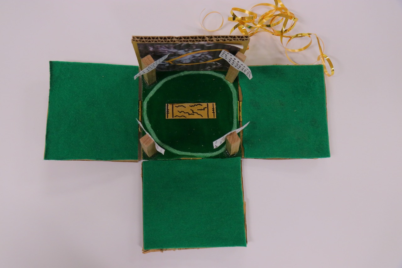
Cardboard with fake grass and green cotton
12 x 12 x 12cm

This artwork expresses how I felt about cricket after I had got my stress fracture, with the photo of my photo you can see a very big clear crack in my L5 bone in my spine. This was due to my bowling action which wasn’t very good for my back health, this caused my to be in a back brace for 24/7 for 6-8 weeks. This injury caused me to fall into a depressed state as I couldn’t do the simple things I took for granted like walking without getting sharp pain and even bending over to grab something I dropped. As the pitch has cracks in it and as the lights are dimmed with blackness it all represents how the back injury caused me to fall away from the game and how I slowly lost interest in continuing to play Cricket as I was scared that this would reoccur.


Lachie Mayne
Untitled
Mixed media
12 x 12 x 12cm


The beef industry is very diverse and selling bulls is a small part of this great industry. We have endured the worst drought in 100 years and many cattle died during this event, at the height of the drought many farmers had no money left to keep feeding their stock so tragically they were forced to sell their breeding stock which significantly impacted me. The follow on affect was immense when farmers couldn’t by bulls and we couldn’t sell our herd, I felt we were imprisoned but there is always hope. I was scared by the desperation of my parents anguish during this time, the stress and raw emotion affected me deeply. “Me Inside a Cube”  has neutral colours representing the daily grind of no rain but dust and heat, like ground hog day. The shape creates depth and shadows with filtered light. Life continues, seasons change and like the photo that goes with the cube the rains finally came and to see the colour green is so good my soul. 


Callum O’Connor 
Life balance 
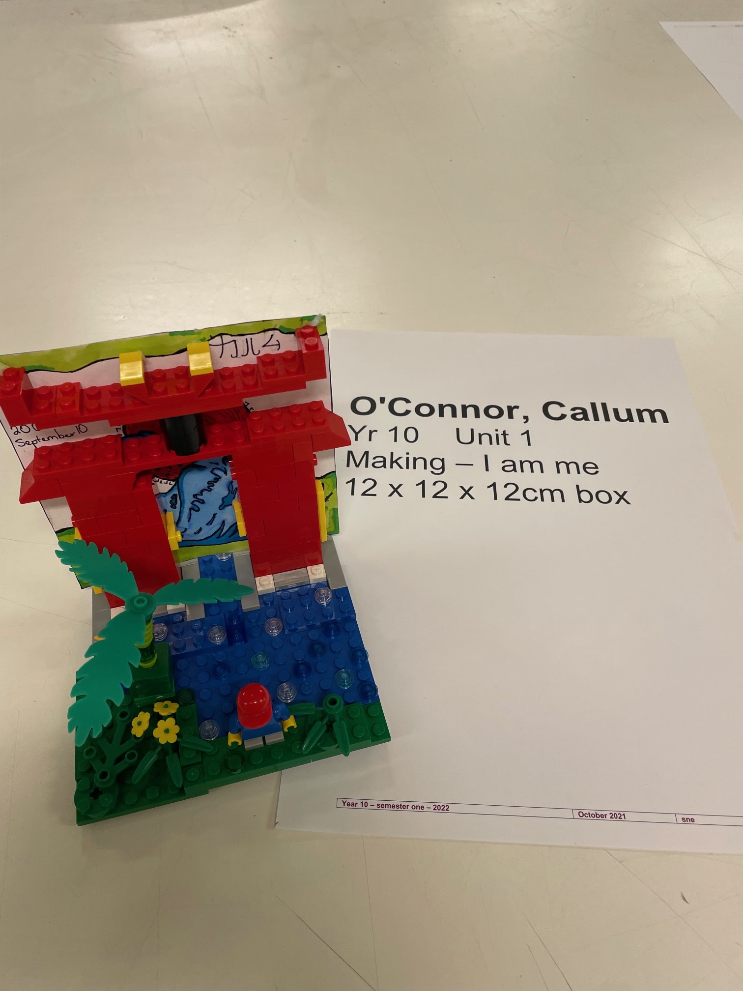
Mixed Media: Lego bricks, copic marker, pen, paper 
12x12x12

My work explores my childhood and my past life living in Japan when I was young. With many artists influencing me to create this artwork I incorporated many of the techniques they used. This is more of a modern type of artwork as it uses Lego blocks to tell the story of my past life.
I was born in Hiroshima Japan in 2006 where I was the younger brother. I lived in japan for a few years and loved the artwork and architecture there. I recently went on a cruise ship to Japan and felt as if it was yesterday that I lived there. The memories of my childhood were spent in the Japanese parks. 
This artwork represents my past life and how time goes so fast. Using the media of Lego bricks, I constructed this image to recreate when I visited the Miajima Shrine as a young 5-year-old. By using Lego characters to represent me and showcasing the image of me in Japan really shows the symbolism of this artwork.
The Lego blocks are used to represent childhood as many young people use them as they are creative. I used the Japanese characters to write my name symbolizing how if I stayed in Japan I would have a completely different culture and personality. I created the waves in a Japanese style to really show the effect of my life and time there.


Cooper O’Neill

Untitled

Mixed Media

12 x 12 x 12cm


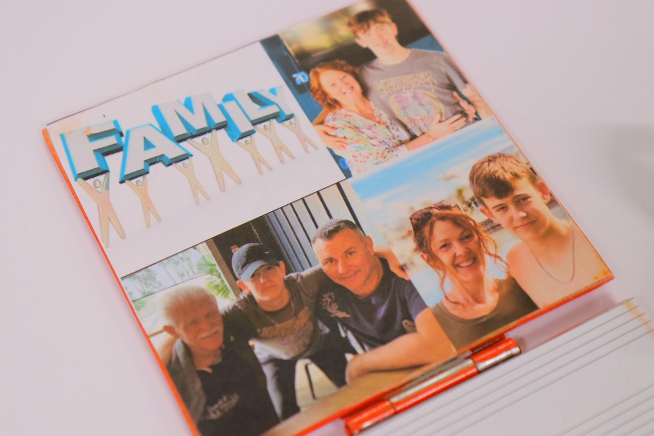
My artwork is related to me because it includes of all my favorite activities and many different parts of my life. On the outside it looks like a present and I did this to demonstrate life is a gift. Each part of the box inside shows an aspect of my life, for example: Sports, Family and Friends. The letter ‘C’ on the top represents my name – Cooper.

I made the middle box sport because it is a very important and central part of my life. I have a rugby field and basketball court because these are two sports I play and enjoy. Underneath that I have included my pets because my dog and cat are a big part of my life. They have helped me through a lot therefore they are represented by a heart.

On either side I put my friends and water activities such as rowing, because they are both very important to me. I do not have any siblings, so my TSS mates truly are my band of brothers. I also have included music because it is a big part of my daily life. I enjoy listening to music and find it has the ability to positively impact my feelings.

I have my family in the top area of the box. I placed it there because they are so important to me and they are the lid to my life, helping to hold everything in place. On the underside, I have included a cross symbol to represent my Christian values which form the platform for all parts of my life.

The box is orange as it is a favourite colour of mine and bright and cheerful. The use of a ribbon to hold the box (my life) together, demonstrates that life is fragile and how sometimes it feels things can fall apart. But they can be put back together again.


Jonathan Paterson
The Gaming Mancave
Wood, plaster, paper
12 x 12 x 12cm

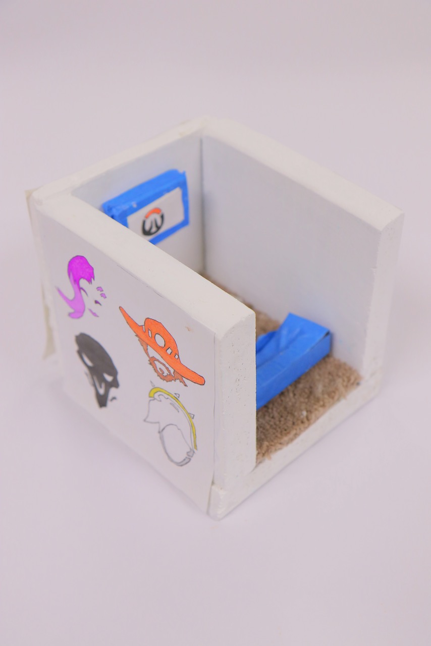
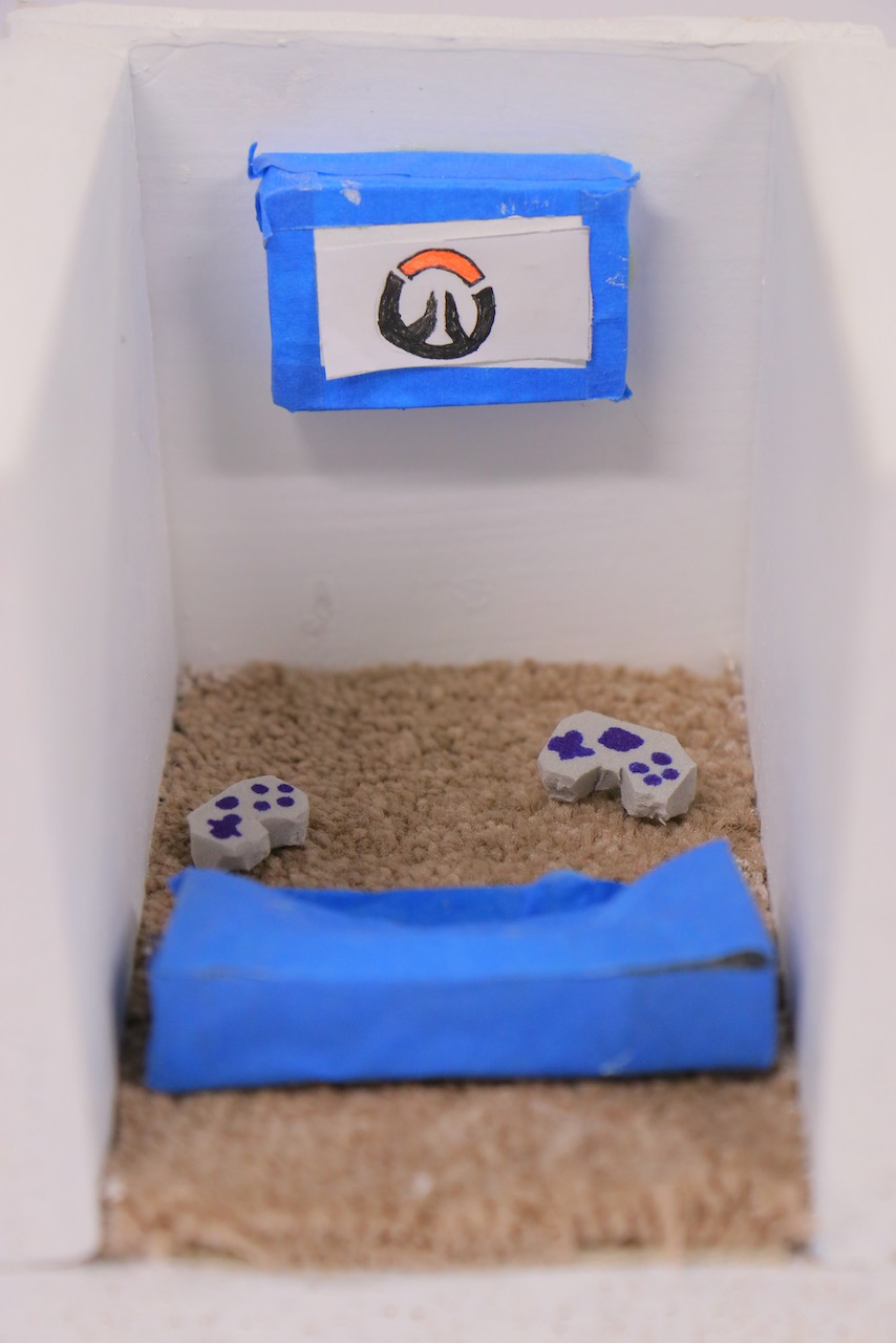
This artwork represents my life and how gaming has influenced it. There are obstacles in video games that I play and this is similar to the obstacles I confront in my life. I selected the icons from the Overwatch game to draw on the outside because it is a game that requires teamwork. That is why I have included two controllers and a sofa that fits more than one person. My intention was to use a lot of white so that everything apart from the gaming is simplistically presented and it highlights the key features which are the household objects inside the cube and the drawings on the outside. I have used wood on the outer boundary, because this creates a solid structure similar to a house.


Jack Primi
Golf
Golf balls, imitation grass, hot glue
12 x 12 x 12cm

Overall my art work is sturdy and represents something about me which was the task was about representing something about yourself. In the process of making the artwork it wasn’t hard to make it but to find grass that would suit the green at the top and the golf balls that I had to find somewhere that were cheap but in the end I found some of my old golf balls.


Luke Reinhold
Paths and Antipathy
Mixed media
12 x 12 x 12cm

Within this self portrait I have displayed the emotion of anxiety and guilt, representing them with a weight each. Each weight corresponds to how heavy or how big the impact the emotion is on my state of mind. As of the “Paths” part of the title. A treadmill was attached into the piece, tagged with the word goals. This treadmill is displayed as a form of symbolism, how much constant and continuous work must be applied to reach and complete a goal. Such the use of a treadmill in which you continuously run until reaching your finishing point or giving up.

The revolving theme of this self portrait is of mindset in a symbolic form of weights. As while I may not lift weights physically, I constantly carry heavier dumbbells of negative emotions and self doubt.


Lucas Yang
“锦瑟华年”(In The Bloom Of Youth)
Digital Animation

The Animation “In The Bloom Of Youth” is a representation of myself in the period of puberty and the uniqueness of each person. I used different themes and elements to show the different stages of puberty and youth. There are 6 stages, from the first (the start of puberty) to the last (end of puberty and becomes a man). Each person will go through their stages of puberty, starting as an energetic young man and going through the challenges that they have to face and finally become a grown-up man with mature thoughts and thinking, stepping into the unpredictable future. I focused on three main elements; Fire, tree, and water to show my understanding of how each stage should look like. Fire is wild and enthusiastic, trees are forceful and sturdy, water is shapeless and quiet, people should have their own element to represent themselves, everyone is unique, everyone is different.


The Bloom Of Youth is like fire, without oxygen it won't burn; I am who I am, a flame of larruping color.
The Bloom Of Youth is like trees, without nutrients it won't grow; I am who I am, an extremely splendid flower.
The Bloom Of Youth is like an ocean, without wind it won’t storm; I am who I am, a wave that glints in the sun.


Stephen Eardley
Life balance
Mixed media – wooden base, paper dowel, plastic and wood beads, pva glue and paint concentrate, builders glue
12 x 12 x 12cm

This artwork explores the idea of life balance. This is represented by creating four cascading coloured towers to represent the different  aspects of  a lived life.
The colour symbolism is  Green = work, red = family, blue = health and purple = friends/fun. There is a personal analysis looking at the balances currently in my life. The green dominates suggesting work is consuming and spills flowing over the other colours. The imbalance is suggested by the quantity of colour on each column.
The heavy wooden base symbolizes a strong personal foundation.
The purpose of the artwork is to invite the audience to consider their own balances in a lived life.